Does it work in the login screen?
Have you followed the instructions that can be found in the official support pages to install Plasma? Installing a different DE in Pop (or any other distro that comes with a DE preinstalled) isn’t so simple. You may want to test if the problem persists if you login with a brand new user, if not then it means that something in ~/.config is probably broken.
System76 Power Management Extension

Hi, there! Most people here probably use Pop!_OS so this isn’t required, but if you use System76 tools (like the scheduler and power daemons) on recent Gnome versions, then you may want to take a look at this fork.
I’ve made this because I use System76 tools with ArchLinux that has a newer Gnome version that isn’t supported by the stock Gnome extension. Maybe it’s useful to someone else.
Cheers
Yes, if Use System Theme is enabled and Use Dark Theme isn’t then the dividers are visible when the system uses light theme. But then they are barely visible when the system changes to dark theme. 🙃
I usually keep the manual theme set to dark because it’s my preferred theme that I want to use when I disable the option to use the system settings.
Hello! Just wanted to say that it's even worse now on v0.2.1+11 when both automatic theme and use dark mode is enabled in Settings > Theming (for some reason the theme changes when the dark option is enabled).

Of course that's why they had so many new accounts so fast! And that's why removing the Threads account also deletes your Instagram one! No way a bad app like that, missing the basic features (front what I've read in reviews), would have so many users so fast!
Hello, there! I really like the overall feel of Thunder, and very excited to know that there's an iOS version as well (which I have not tried yet tho).
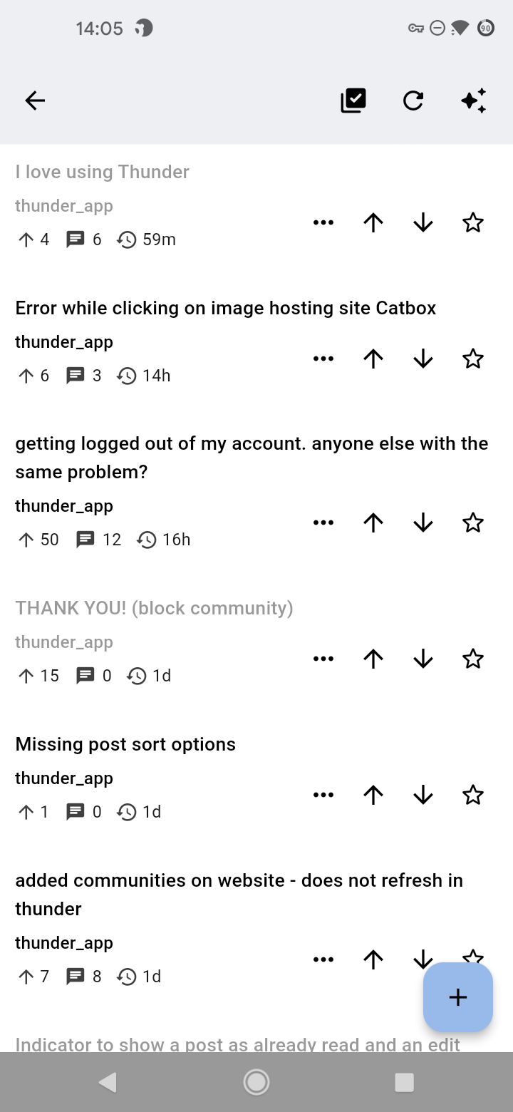
But I think some improvements can be made to the subscriptions list in general: when using either the compact or normal view, it's pretty much plain unless the post itself has an embedded image. And it is even somewhat hard to differentiate individual cards as there is only a (thin) line separating them and the link banner is very thick.
Just for comparison (and maybe inspiration), here is a gallery with screenshots for the same feed in Thunder and two other Lemmy clients:
https://postimg.cc/gallery/6yX27nv
------
!app1
!app2