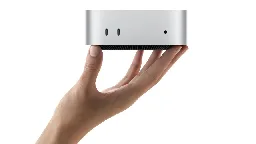
Apple’s first Mac mini redesign in 14 years looks like a big aluminum Apple TV
Apple’s first Mac mini redesign in 14 years looks like a big aluminum Apple TV
arstechnica.com Apple’s first Mac mini redesign in 14 years looks like a big aluminum Apple TV
The smaller mini loses some ports but gets tons of other functional updates.

4
crossposts
You're viewing a single thread.
View all comments
139
comments
Well, it would be
- more confusing if they shaped it like an iPhone,
- more unstable if they shaped it like the magic mouse with the power port at the bottom,
- super cute if they kept the exact mac pro tower design but super smol,
- actually useful as a vase of they used that cylinder mac pro design from 10 years ago
46 1 ReplyThat cilinder Mac Pro was a fever dream but I still love the design
26 0 ReplySmol Mac Pro would have been the best possible reality here.
20 0 ReplyImagine a lil tiny ornamental CD drive that just pops out!
5 0 Reply
more unstable if they shaped it like the magic mouse with the power port at the bottom
Sounds like someone didn't wear their Brave pants today
9 1 Reply- way sexier if they shaped it so it could wear tight little brave pants
(and the 'turn on' button would have been covered by pants in this case as well, which sounds proper)
6 0 Reply- way sexier if they shaped it so it could wear tight little brave pants
You've viewed 139 comments.
Scroll to top